Rhinobair
- Interior design
- Project Management
Rhinobair, a new café concept in High Wycombe approached us to design an interior aimed to attract a young, street-savvy clientele. Situated in the main shopping area, Rhinobair is one of very few alternative and health conscious eat-in establishments the high street has to offer. With this in mind, we wanted to create an inviting space to draw customers in, away from the busy high street.
Creating the right vibe
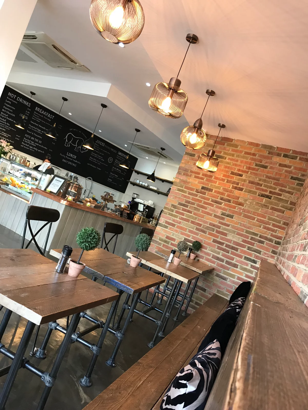
We designed a contemporary look using industrial finishes like sealed plaster, concrete floor titles and a ‘brick-slips’ feature wall, all developed to appeal to the target market aged between 25-55.
Café Layout
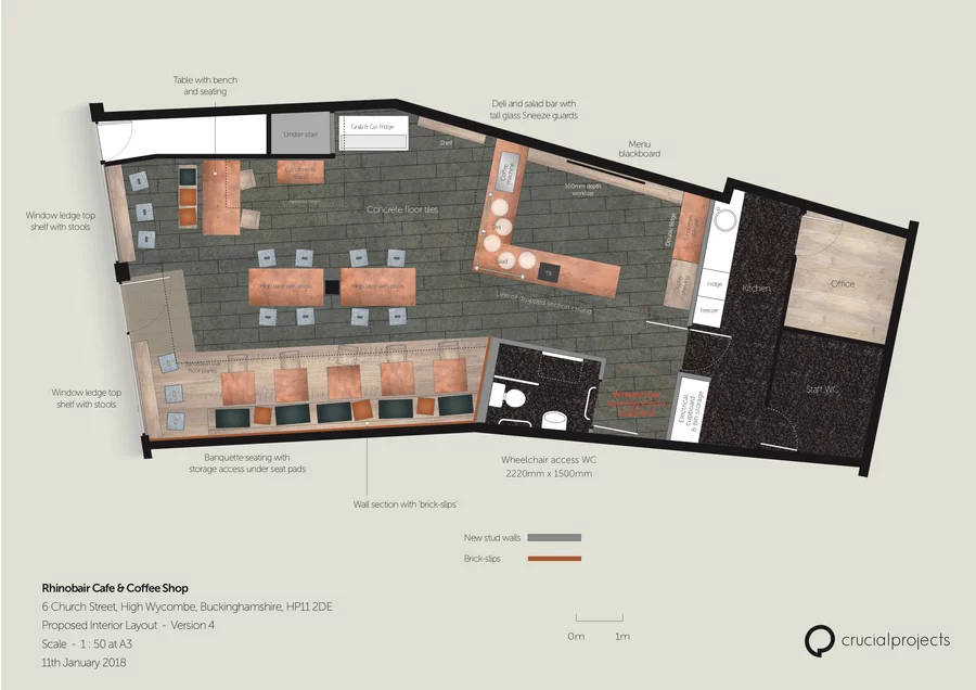
Floorplan / Technical DrawingFeatures:
- High tables with stools
- Banquette seating with storage
- Concrete floor tiles
- Menu blackboard
- Feature wall with 'brick-slips'
- Custom drop section ceiling
Interior Design Concept
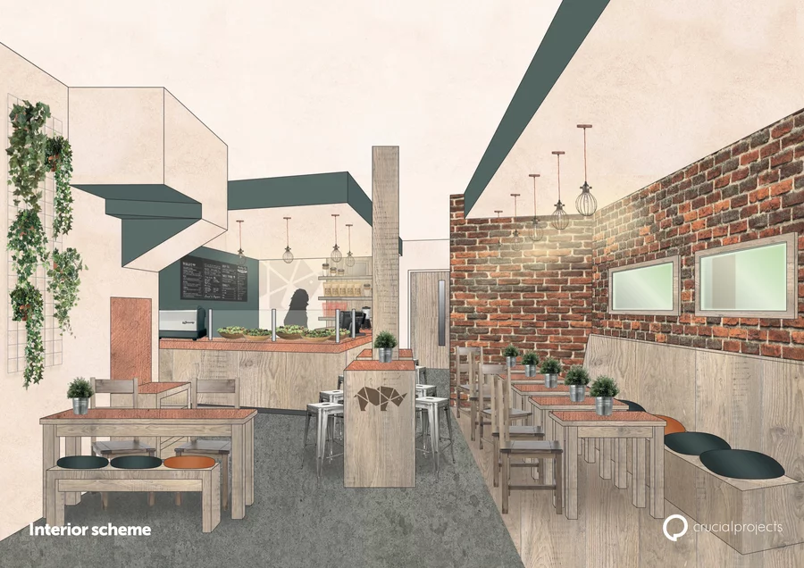
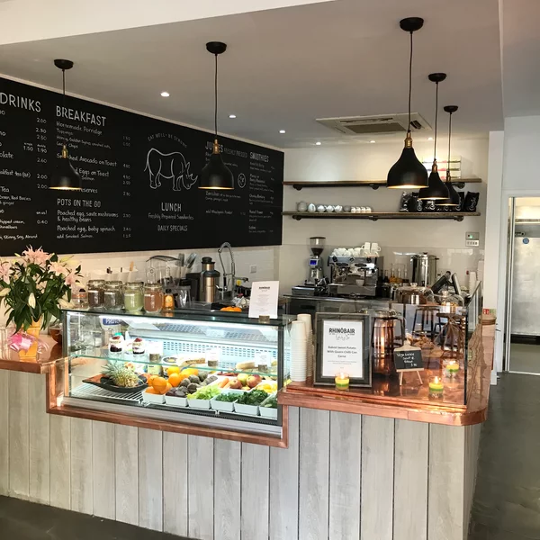
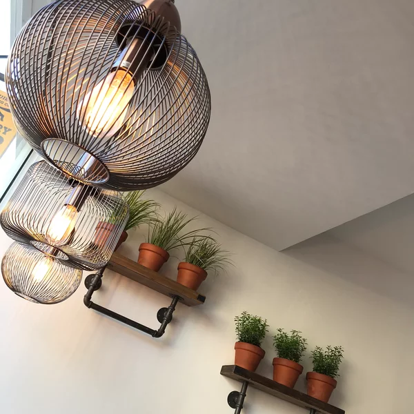
Visual mock upThe café’s name and Rhino-shaped logo is inspired by the charity Unite Against Poaching - who aim to fight the war against rhino poaching in South Africa, a cause the café supports with a percentage of its profits. Reflecting its passion for nature, we used textures with an ‘unfinished’ look for example, band sawn timber for joinery and flooring in some areas. We finished the counters and table tops with copper and introduced LED hanging pendants, both adding warmth. Lastly we introduced wall mounted plant displays and hanging baskets for a burst of life and vibrancy.
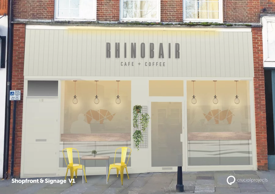
Exterior Design Concept
Visual mock upTo reflect the modern-rustic material finishes of the interior, we used tongue & groove wood panelling for the fascia signage, finished in an earthy stone paint with crisp logo branding. Mesh grill mounted plants helped to soften to the look and create a warm and inviting atmosphere, especially when sitting out in the sunshine!
Laila Choudhry Rhinobair“We loved Andrew’s ideas for the inside of the shop, creating a classy and clean look with a rustic edge!”


 Previous Project
